Pantone's Guide to the Spring Colours of 2016

Ready for a colourful Spring wedding?
Yes, we know that we are stuck in the middle of winter. But let’s turn a blind eye to the drop in temperature and look on the bright time of the year: Spring. And in terms of wedding decoration one thing is sure: It will be colourful – but soft. Our colour expert and trend forecaster Pantone Color Institute has recently named the top 10 Spring trend colours. With Buttercup and Peach Echo included, the bride will be spoiled for choice. And of course, we want to share the entire colour palette with you. Enjoy!
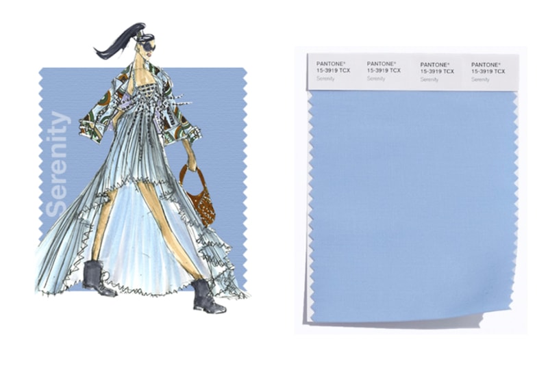
Colours of the Year: Rose Quartz and Serenity
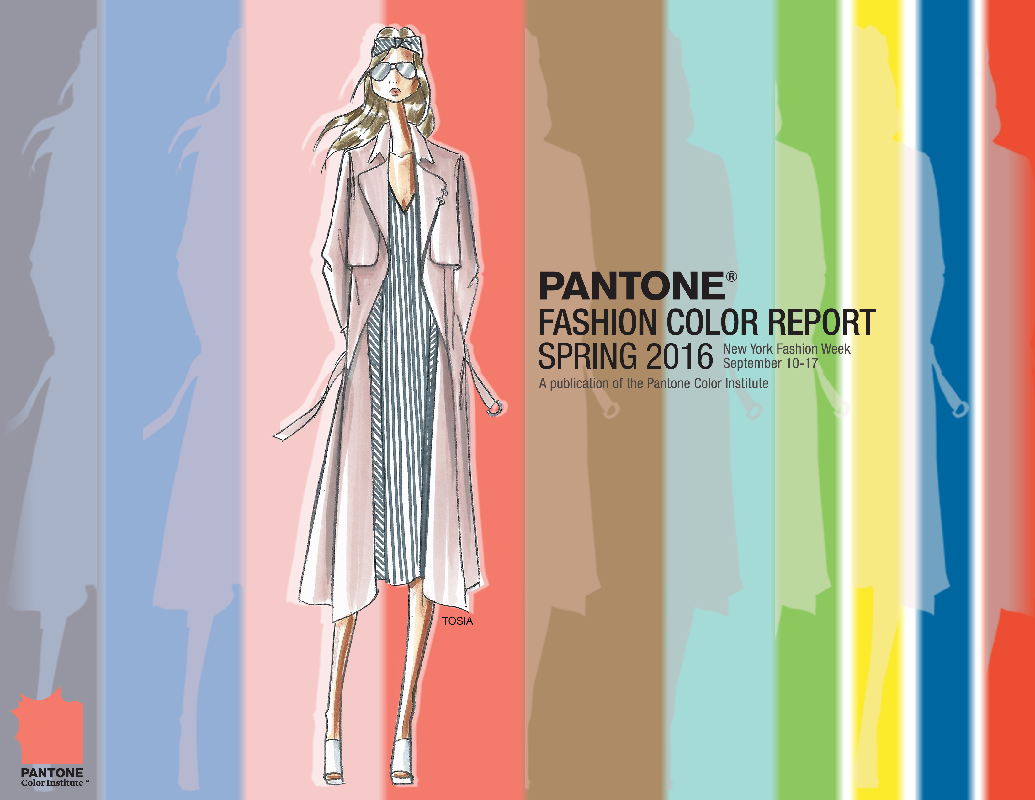
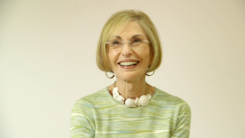
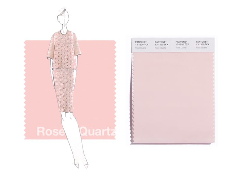
Always included in the Spring’s Fashion Color Report is the Pantone Colour of the Year. For 16 years the Pantone Color Institute has been annually selecting the Colour of the Year, a colour that reflects the global Zeitgeist. “What we do is try to read the pulse of the public,” says Leatrice Eiseman, Executive Director of the Pantone Color Institute. Therefore, a colour expert team led by Eiseman literally comb the world looking for new colour influences. And this year for the first time in history, Pantone has decided to shake things up and give us not one, but two Colours of the Year: Rose Quartz Pantone 13–1520 and Serenity Pantone 15-3919. As its name suggests, Rose Quartz is a gentle pink pastel tone that conveys compassion and composure. Serenity, as a pastel blue tone, comforts with a calming effect bringing feelings of respite and relaxation even in turbulent times. According to Eiseman the two colours reflect well being, order and tranquillity: “With the whole greater than its individual parts, joined together Serenity and Rose Quartz demonstrate an inherent balance between a warmer embracing rose tone and the cooler tranquil blue, reflecting connection and wellness as well as a soothing sense of order and peace.”
And those pastel pink and soft blue are true wedding must haves: Their pastel transparency can be used in the selection of fantastic accessories to the wedding. Invitations, menu cards, flowers, room and table decorations can be optimally designed in the Colours of the Year. As an idea: Serenity can be drawn as a sky-blue string through the entire areas or as a background colour of the invitations. For those who like romance will immediately take the Rose Quartz flowery embroidery ideas on the tablecloth to their heart. Add silver for some splash and sparkle.
Behind the scenes
The Pantone Fashion Color Report launches traditionally on the first day of New York Fashion Week and presents the ten most important trend colours of women’s and men’s fashion for the upcoming year, which the designers are using in their upcoming collections. As a tribute to the beauty of natural resources the colours of this year serve as a vehicle to promote relaxation, curiosity and exploration. “Yet with our culture still surrounded by so much uncertainty, we are continuing to yearn for balance by incorporating those softer shades that offer a sense of calm and relaxation,” explains Eiseman. “The colour palettes of this season transport us to a happier, sunnier place where we feel free to express a wittier version of our real selves.” The designers were inspired by the contrast of urban design and by vegetation. This results in surprising colour combinations. The collections remind of architecture and travel and bring a sense of nostalgia with it. Designers took for example inspirations from the destination Cuba to play with courageous colour statements and coupling these vibrant hues with quieting, classic and more natural tones. But here is no clear difference between the colour palette for men and women – Unisex is trend:
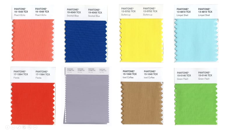
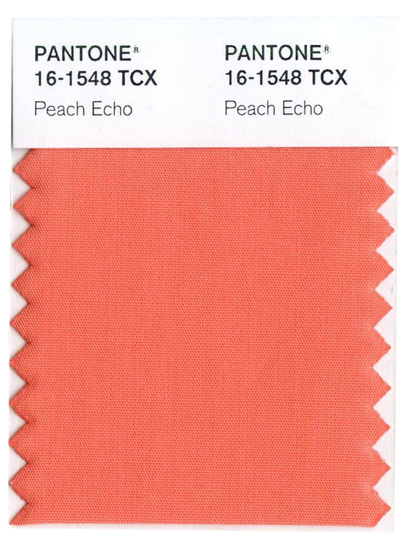
PANTONE 161548 Peach Echo:
The fashion and design communities, and consequently, consumers, have been in love with orange for several seasons. Coming to the fore this Spring: Peach Echo, a shade that emanates friendlier qualities, evoking warmth and accessibility. Whether you incorporate this beautiful orange hue as a subtle accent or as the dominant colour, it will be sure to add an on-trend and bright addition to your wedding decor.
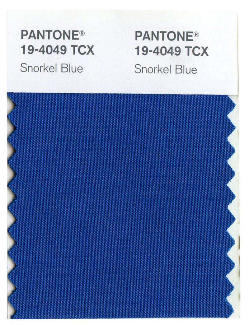
PANTONE 19-4049 Snorkel Blue:
Playing in the navy family, but with a happier, more energetic context, the maritime inspired, Snorkel Blue implies a relaxing vacation and encourages escape – perfect for a destination or coastal wedding.
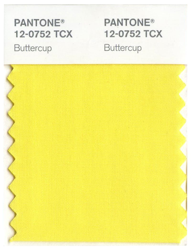
PANTONE 12-0752 Buttercup:
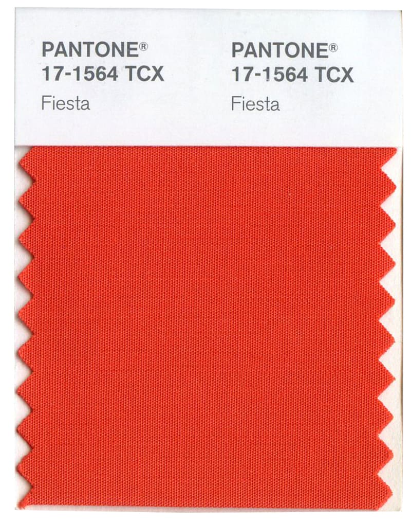
While the majority of the Spring/Summer palette trends toward calmness, a few diversions from the theme emerge that offer a contrast. With Buttercup, designers reveal a shining beacon transporting its wearer to a happier, sunnier place. The high energy Fiesta is a harbinger of excitement, encouraging free-spirited exploration to unknown but welcoming locales – perfect for that adventurous and energetic couple!
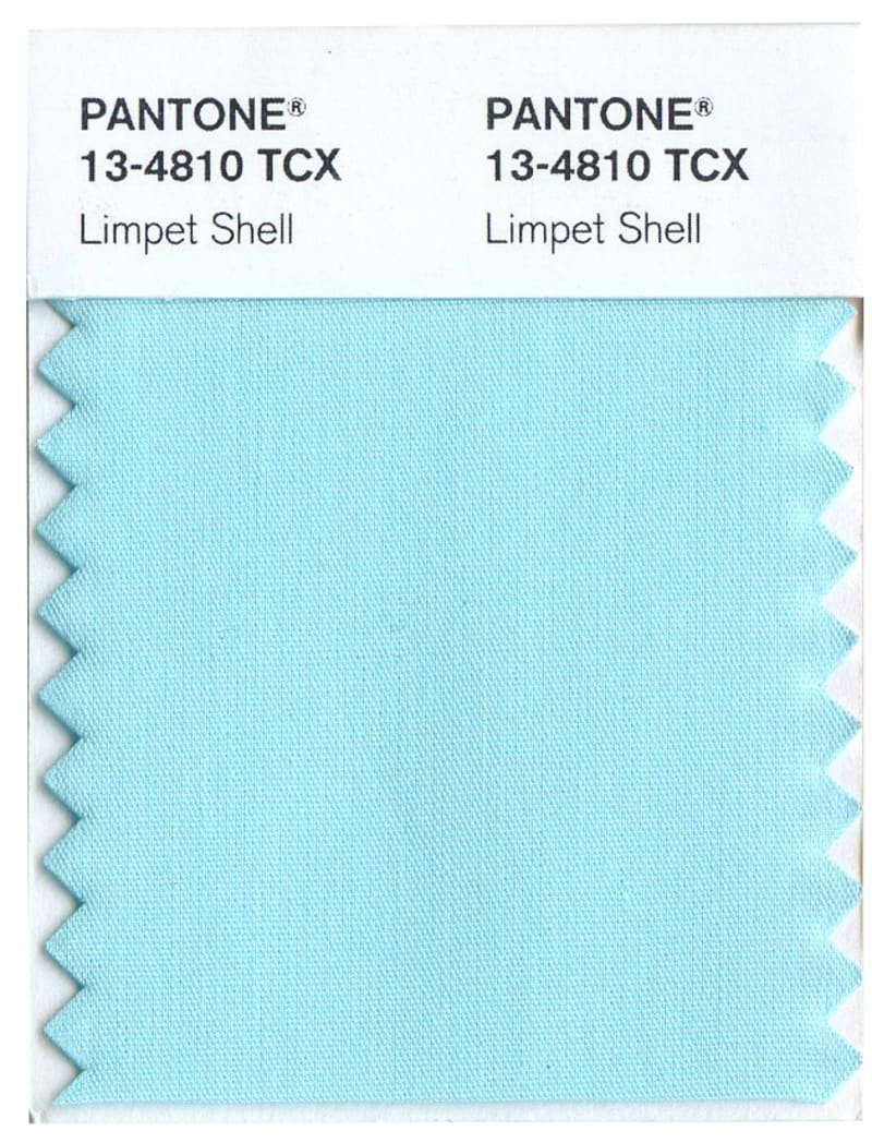
PANTONE 13-4810 Limpet Shell:
A shade of aqua that leans toward the green family, Limpet Shell is clear, clean and defined. Suggestive of clarity and freshness, its crisp and modern influences evoke a deliberate, mindful tranquillity. Limpet Shell would make an ideal colour for more intimate weddings with your nearest and dearest close.
PANTONE 17-1564 Fiesta:
The high energy Fiesta is a harbinger of excitement, encouraging free-spirited exploration to unknown but welcoming locales.
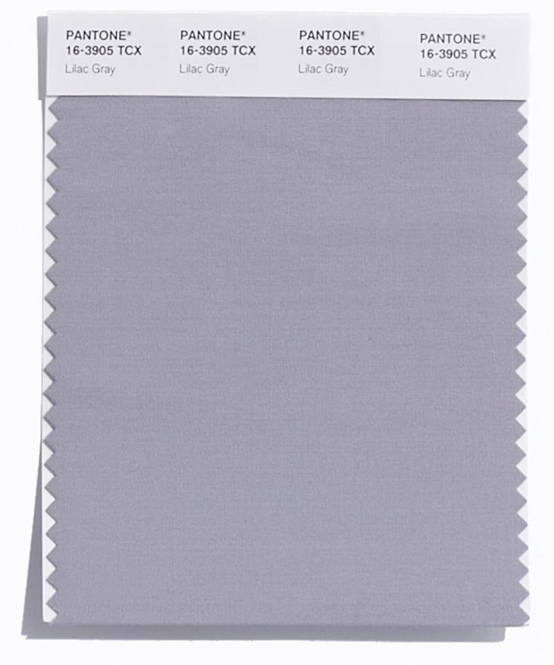
PANTONE 16-3905 Lilac Gray:
As in most any season, the need for neutrals in the beige and grey family arises. The subtlety of the lilac undertone in Lilac Gray adds a distinctive edge to this classic grey shade.
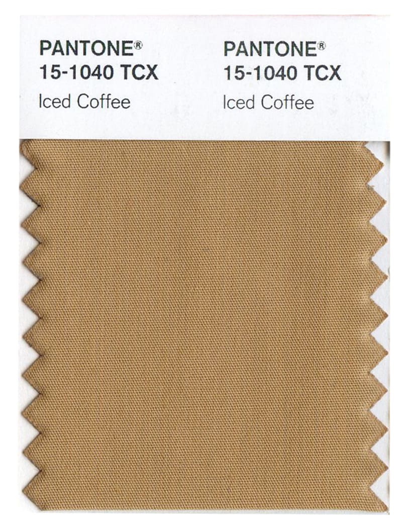
PANTONE 15-1040 Iced Coffee:
Iced Coffee is a transitional colour that will take us through the season as another strong neutral. With its natural earthy quality, the softness and subtlety of Iced Coffee creates a stable foundation when combined with the rest of this season’s palette.
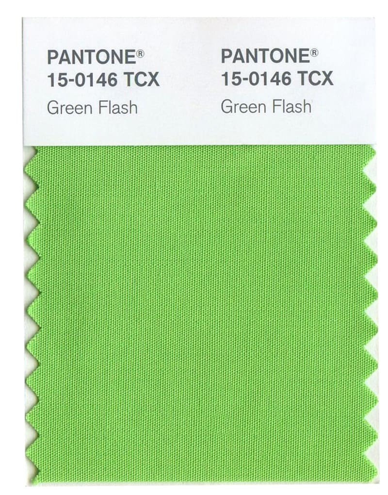
PANTONE 15-0146 Green Flash:
Green Flash calls on its wearer to explore and escape the mundane, radiating an openness that combines with the rest of the palette in unexpected but serendipitous ways. The popularity of this brilliant hue is representative of nature’s persistent influence even in urban environments, a trend continuing to inspire designers.
Happy Planning! For more styling tips head over to our ‘Tips and Tricks’ page for more inspiration.
Related articles